


Light and dark colors on the facade: how to combine them
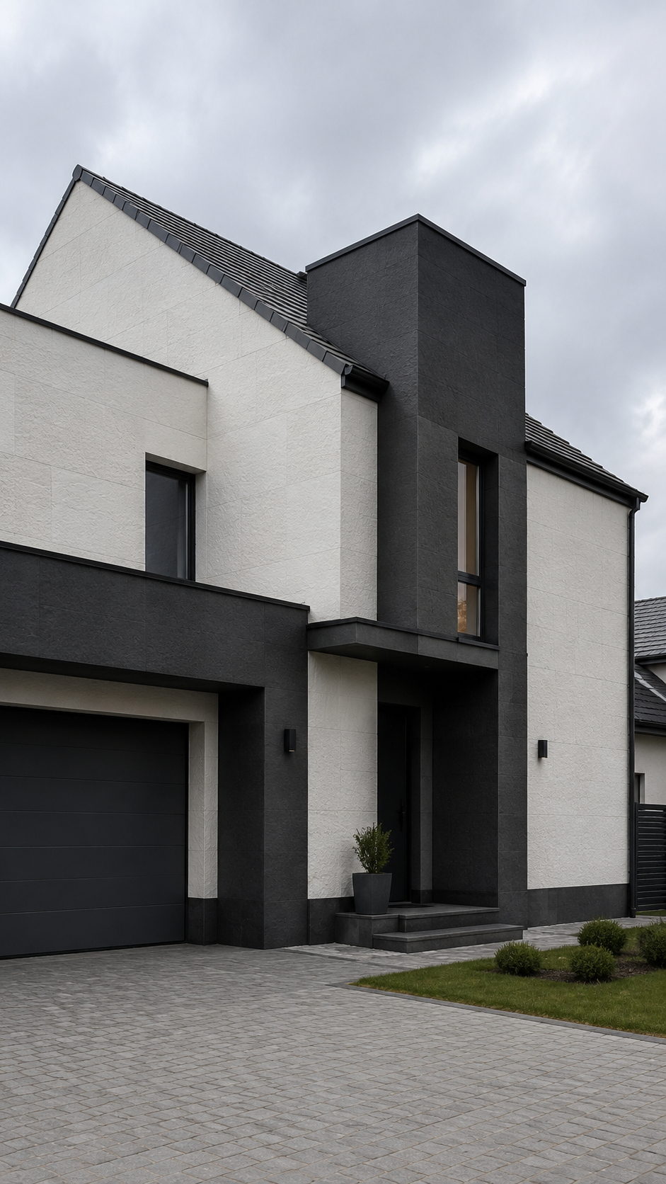
The combination of light and dark shades on the facade of a house can make the difference between an ordinary building and one with a strong visual character. The key is not to simply pick two colors you like, but to get the proportions right, anchor each transition in the geometry of the building and repeat the chromatic accent in the finishing elements. This logic applies regardless of the cladding material — and with KORDEKO flexible cladding panels you can implement it on any surface, including corners, columns or arches.
Why you can't divide the facade randomly
One of the most common mistakes is dividing the facade in half with a horizontal line unrelated to the building's architecture. If the transition between colors occurs randomly, the facade looks unfinished, as if decisions were made during assembly, not before.
The transition line must always be anchored in a structural or architectural element:
- floor level between floors;
- the line of window frames or frames;
- the edge of a volume retreating or advancing from the main plane;
- plinth height;
- an architectural girdle or cornice.
Thus, the transition from one shade to another becomes part of the project, not an improvised correction.
Correct Proportions: How Much Surface Each Color Takes Up
For most individual homes, a simple ratio works: 70–80% light base color and 20–30% dark or textured accent. The facade remains calm and unified, and the accents strengthen the architecture without visually burdening it.
If the dark shade exceeds 30% of the area, the building may appear more massive and smaller than it really is. The effect is opposite to the desired one.
Light colors — warm white, light beige, stone gray, sand — visually increase the volume and are suitable for large surfaces. Pure colors, including bright white, have the disadvantage of highlighting dirt and can appear cold. Natural, calmer shades are more practical and aesthetically more durable.
Where dark colors work best
Dark shades should not dominate the facade — their role is to emphasize the architecture. The areas where it works best are:
- the base of the building;
- input group and portal;
- the files between the windows;
- volumes in relief or in retreat;
- columns and pilasters;
- the separate wall of a terrace or a garage.
The dark plinth is one of the most visually balanced combinations: it hides soil and water splashes, visually anchors the house in the terrain and naturally correlates with a closed roof or dark joinery. However, pure black is rarely a good choice—white dust, efflorescence, and rain marks are clearly visible on very dark surfaces. Medium graphite, anthracite or grey-brown are more practical.
S Series — Slate Anthracite from the KORDEKO range is frequently used precisely for plinths and accents, thanks to its balanced tone and natural slate texture. The panels have 4 kg/m² and are installed without demolishing the existing plywood, which significantly simplifies the renovation.
How to match the color of the facade to the roof, windows and details
A unitary facade means that the chosen chromatic accent is repeated in at least two or three surrounding elements: the color of the cladding, window frame, gutters and downspouts, doors, balustrades or outdoor lighting devices.
It is not mandatory that all these elements are identical in shade. It is enough that the tones are close in color temperature. Cool graphite is naturally associated with white and gray facades; warm brown works with beige, sand and wood textures. Mixing cool and warm tones without a clear logic produces an effect of visual incoherence that is difficult to correct later.
You can see how this logic works in practice in completed KORDEKO projects , where the combinations between different series illustrate precisely this chromatic coherence.
Why texture matters as much as color
The same shade is perceived differently on a smooth surface than on a textured one. A raised texture creates its own shadows, so the material can appear darker in cloudy weather and lighter in direct sunlight. This is not an imperfection—it is a characteristic of natural mineral finishes.
The practical consequence: always choose the final sample in natural light, outside, not on the phone screen or in the showroom. If you combine two KORDEKO series with different textures — for example R — Rock Stone for the main surface and S — Slate for the plinth — check both samples simultaneously under the same light conditions.
KORDEKO panels have a thickness of 2.5–5 mm and lend themselves to combining series on the same facade without visible steps, precisely because of tight manufacturing tolerances (length ±3 mm , width ±0.5 mm ).
Plan the color distribution before installation
On facades with external thermal insulation system (ETICS/EIFS), the color distribution, textured inserts and decorative belts must be determined before ordering the material. KORDEKO is the only stone-look material compatible with ETICS systems, due to its weight of 4 kg/m² — natural stone and ceramics ( 25–35 kg/m² ) cannot be applied to such systems.
A simple sketch of the facade, with color-coded areas, helps you correctly calculate the quantities on each series and avoid narrow cuts at transitions. The assembly speed of 25 m²/day per worker means that a house of 250 m² is finished in 1–2 weeks — but only if the color scheme is clear from the start.
If you need support in choosing the right combination, you can request a consultation — the KORDEKO team can analyze your facade and recommend compatible series and shades.
Basic rules to avoid the "colored patch" effect
The more complex the architecture of the house, the calmer the color scheme must be. A few principles that work consistently:
- Maximum of two main shades per facade;
- A possible third color only in small details (cornices, jambs);
- The dark accent is repeated in at least two areas, it does not appear in isolation;
- Don't change color at every corner or niche;
- Don't mix cool and warm tones without a connecting logic.
Facades that respect these proportions look neat and coherent regardless of the angle from which they are viewed. Discover the entire range of series and colors available in the catalog of KORDEKO panels .
Contacts Kordeko
Explore more